3.4.19 -10.7.19 (Week 1 - Week 15)
Abigail Bea Chong Ka Yee (0333966)
Design Principles
Exercises & Projects
FINAL PROJECT
For our final project, we had to take pictures of billboards in real life to investigate the print culture around us. Wherever we go, we see billboards: on buildings, on roadways, on elevated sidewalks. They have all been designed with different sizes, orientations, and purposes. The main importance of this project was to create a billboard that people would understand without having too many words or elements on the billboards. These are some of the billboards that I took:
 |
| Fig 1.1 Haagen-Dars billboard #1 |
 |
| Fig 1.2 Billboard #2 |
 |
| Fig 1.3 Subway billboard #3 |
 |
| Fig 1.4 Apartment billboard #4 |
 |
| Fig 1.5 Giant (shopping mall) billboard #5 |
 |
| Fig 1.6 Rubine billboard #6 |
 |
| Fig 1.7 Aurora Place billboard #7 |
 |
| Fig 1.8 Samsung S10 billboard #8 |
 |
| Fig 1.9 Foresto billboard #9 |
 |
| Fig 1.10 AbuThen Billboard #10 |
Out of all the billboards above I chose fig 1.10 as my main inspiration. As soon as I saw the phone I immediately had a clear idea in mind I just did not know how to execute it yet, so I began researching more. At first, I thought that AbuThen was a platform where people could sell their items like Carousell because of how it was advertised on the billboard. But according to their website (
https://abuthen.asia/) the AbuThen app is the 'go to' app for cool youngsters to interact with each other but also to find the coolest deals and current happenings. It is also where the trendsetters and early adopters go to for their entertainment and privileges fix as well as be seen doing it. Now my idea came from how I have noticed a lot of us Malaysians including myself love to drink bubble tea but also be on their phones most of the time. So I wanted to express a message about how we shouldn't let our phones control our lives. Here are the sketches for my idea:
 |
| Fig 1.11 Sketches #1 |
 |
| Fig 1.12 Sketches #2 |
I ended up choosing #3 in fig 1.11 as the drawing I was going for but I will also add the beach umbrellas too. I chose Adobe Illustrator as my media to use. So I started with making three beach chairs (the background are colours I chose are a default, which is not my final design yet)
 |
| Fig 1.13 Process #1 |
Then I wanted to add more of a beach vibe so I added strips to the chairs.
 |
| Fig 1.14 Process #2 |
Next, I made three types of phones which is a flip phone, iPhone and Samsung using outlines of pictures. And also picked which colours were suitable enough.
 |
| Fig 1.15 Process #3 (flip phone) |
 |
| Fig 1.16 Process #4 (iPhone) |
 |
| Fig 1.17 Process #5 (Samsung) |
Then I placed the three phones onto the chairs.
 |
| Fig 1.18 Process #6 |
I made a table and I wanted to add a wooden texture onto it so I added it using clipping mask.
 |
| Fig 1.19 Process #7 (table with texture) |
I made three drinks in total for three phones, they consist of coconut water, margarita, and pina colada.
 |
| Fig 1.20 Process #8 (coconut water) |
 |
| Fig 1.21 Process #9 (margarita) |
 |
| Fig 1.22 Process #10 (pina colada) |
Next, I made the beach umbrellas but I did not like how it turned out so I made another one in fig 1.24.
 |
| Fig 1.23 Process #11 (failed umbrellas) |
New and improved umbrella.
 |
| Fig 1.24 Process #12 (new and improved umbrella) |
Adding the umbrellas into the main picture.
 |
| Fig 1.25 Process #13 |
It was time to finally change the ugly background so I found a beach colour palette where I adjusted the colours to fit the whole feeling of the artwork. Thus I also added shadows under the tables and chairs. But don't be fooled I'm not done yet (':
 |
| Fig 1.26 Process #14 |
The composition felt a bit boring to me so I added the ocean to give it more of an in-dept feel.
 |
| Fig 1.27 Process #15 |
Next came the clouds.
 |
| Fig 1.28 Process #16 |
 |
| Fig 1.29 Process #17 |
I moved on to the crucial part which was to add the human figures into the artwork. Moreover, also changing the first umbrella to blue to give it variety.
 |
| Fig 1.30 Process #18 (adding the shadows) |
I wanted to give the sand a more realistic texture look so I used the effects > artistic > film grain. Then duplicated the layer and used effects > artistic > sponge whilst selecting multiply for layers and using 30% opacity. Thus I also added shadows to the chairs and phones where the umbrella gave shade to.
 |
| Fig 1.31 Process #19 |
I also touched up on the water to make it look like how sun reflects onto it.
 |
| Fig 1.32 Process #20 |
Last but not least, adding the birds onto the artwork.
 |
| Fig 1.33 Process #21 |
A little close up onto the sand texture and the table texture.
 |
| Fig 1.34 Close up of sandy texture and woody texture |
And my colour palette that I used.
 |
| Fig 1.35 Colour palette |
This is my final outcome of my artwork.
 |
| Fig 2.1 Final Outcome |
Among all the exercises and projects I did this was the most challenging for me, it took a lot of time and effort to complete and be satisfied with what I made. The reason why I made the shadows look like silhouette of people it's because I want to tell people to stop living through their phones. For example, posting about every single thing you do in one day on social media platforms like Instagram, Facebook, etc. So it is basically like a metaphor that the phones are enjoying and living life in the moment more than human beings.
Other than that, in my final artwork I also applied various design principles.
- Repetition: The clouds, umbrellas, tables, birds and chairs
- Texture: woody texture for the tables and sandy texture for the sand
- Alignment: because of how the chairs are arranged
- Pattern & Lines: on the chairs due to it being striped
- Scale: different sizes of clouds
PROJECT 2
For this project, we had to go to an area or place that is near where we live. We had to go there at night or during the day. Moreover, we also had to analyse the visual language of the location using any kind of media; through photos sketches, etc. The feeling of a place using our senses such as sound, touch, smell. Our artwork must utilize 3 or more principles and why it is appropriate to communicate how this particular place is unique. We had to do this using A4 but if that's not suitable we can use A3.
When Ms Sherry introduced this project to me I was quite confused about where I wanted my place to be so I looked up some pictures only to give myself inspiration:
I wanted to take a picture of a certain part in my mum's room since I always go there to pet my cats.
 |
| Fig 1.1 Indoor place in a room |
I had another idea which was to go to a bazaar. Ever since this year, I have been going to quite a few different bazaars.
 |
| Fig 1.2 A bazaar in Istanbul |
The bazaars I went to had a variety of vibes but I always end up going to a plant booth or something creative like a craft and notebook store. So I chose this idea as my main idea. The theme of that bazaar I went to was called teepee land which I'm not sure why they called it that. I have been wanting to go to this bazaar ever since I saw that the organisers (a collaboration between ART + D) had a pop-up market in Lot 10, Bukit Bintang.
 |
| Fig 1.3 Pop-up market from 9-12 May at Lot 10, Buki Bintang |
Then I finally had the chance to go to the 4th bazaar they had which was called Teepee Land. (I think it was also to attract kids to come and paint the teepees since they had an art and crafts booth just for that)
 |
| Fig 1.4 Teepee Land bazaar from 14th - 16th June at Sunway Velocity |
Now on to the pictures I took!! (/ω\)
 |
| Fig 1.5 A photo taken by me |
 |
| Fig 1.6 A photo taken by me |
 |
| Fig 1.7 A photo taken by me |
 |
| Fig 1.8 A photo taken by me |
 |
| Fig 1.9 A photo taken by me |
 |
| Fig 1.10 A photo taken by me |
 |
| Fig 1.11 A photo taken by me |
 |
| Fig 1.12 A photo taken by me |
 |
| Fig 1.13 A photo taken by me |
 |
| Fig 1.14 A photo taken by me |
 |
| Fig 1.15 A photo taken by me |
 |
| Fig 1.16 A photo taken by me |
 |
| Fig 1.17 A photo taken by me |
However, I only used some of the pictures above in my artwork. I wanted to make a collage with some of the pictures. So here is the process:
I made this the main background of my artwork. Which is a table cloth at one of the booth's at the bazaar.
 |
| Fig 1.18 Progress #1 |
Then I used the picture of the plants as the main point of what I want to say about this place that gives me a sense of familiarity.
 |
| Fig 1.19 Progress #2 |
Then I added the main theme of the bazaar which was the word teepee land made out of a cardboard cutout that's why it looked 3D and a teepee.
 |
| Fig 1.20 Progress #3 |
I then added the cute balls of plushies onto the plants and on the inside to make it look like it was sitting there thus popping out.
 |
| Fig 1.21 Progress #4 |
But after showing Ms Anis and Ms Sherry the picture they said the box that had the plants were placed in and the word teepee land was very distracting since I wanted to bring attention to the plants so they told me to take away the box and teepee and the word teepee land away.
So I keep the background the same.
 |
| Fig 2.1 Progress #5 |
Then I got rid of the white box and zoomed in the plants and blurred it a little bit to give it perspective.
 |
| Fig 2.2 Progress #6 |
I added the cute plushie and two teepees to add more of a cute vibe and repetition with both the teepee's and plants.
 |
| Fig 2.3 Progress #7 |
Then I added the cute plushie peeking on the right side.
 |
| Fig 2.4 Progress #8 |
I also added the theme Teepee Land because it looked too plain and another plant in front of the other succulents to give it scale and foreground.
 |
| Fig 2.5 Progress #9 |
After I added the word Teepee Land I thought it looked too cramped and detailed with the background so I blurred the background up to 15%. Thus, I chose the colour pink to give it an overall contrast and in psychology, the colour pink inspires warm and comforting feelings. Which is what I feel in this place.
 |
| Fig 2.6 Progress #10 |
Here is my final piece! I am quite proud of what I managed to create with using only a few pictures and putting them together.
 |
| Fig 2.7 Final Outcome |
One of my classmates said that it looks like a poster, Ms Sherry commented on how I should use this poster to promote this place and that it was a very ugly font for Teepee Land.
PROJECT 1
For our first project, we had to create a self-portrait. It doesn't have to be a literal translation of how we look like but just showing who we are. We were able to choose any media we wanted for this project. At first, I wanted to show myself practicing self-care but I wouldn't see how that translated my personality well. So my next thought was to draw my inner self and outer self since I can like cute and funny things but also at the same time as scary creepy things. These are my sketches for my idea.
 |
| Fig 1.1 My sketches |
I chose the shoes to represent my inner and outer me because I think it portrays myself better than the face with two faces on the side closing into it.
 |
| Fig 1.2 The faces I wanted to draw initially |
I proceeded to find images of shoes to get the sense of composition that I wanted to reference and get inspirations from.
 |
| Fig 1.3 Inspiration #1 |
 |
| Fig 1.4 Inspiration #2 |
 |
| Fig 1.5 Inspiration #3 (also the reference I used) |
 |
| Fig 1.6 My plant named Fia (inspiration #4) |
 |
| Fig 1.7 A marimo plant named borahae (inspiration #5) |
After choosing fig 1.5 as my reference I started sketching out the outline of the shoes with a HB pencil.
 |
| Fig 1.8 Outline of the shoes |
 |
| Fig 1.9 Process of drawing the spikes on the left side of the shoe |
 |
| Fig 1.10 Finished drawing of the shoes using a pencil |
So glad I got to use my favourite pens for this ^ω^
 |
| Fig 1.11 The 0.1 and 0.3 pens I used |
 |
| Fig 1.12 Using the pens in fig 1.11 to outline the shoes |
 |
| 1.13 The final outcome of the shoes |
 |
| Fig 1.14 Overall items I used for this project |
After I finished my artwork I was really proud of how it turned out to be since I used two different media together. I used a Copic marker N7 to colour the shoes and for the socks and the legs, I used pastel. Now for the explanation of why I chose to draw a shoe instead of a face for my self-portrait (◠‿◠✿).
The shoes represent my outer exterior while the socks are my inner exterior. This means that I am actually soft on the inside but hard on the outside thus my friends said that this portrays me very well. There are spikes because sometimes I can be defensive if I feel very highly about a certain topic that someone doesn't have an open mind about or just plainly disrespecting it. There are no laces because people will need to find a way into my soft side to see what I actually am on the inside and not on the outside. I chose black for the shoes because I wanted that to show my dark side on the outside while the socks had a variety of colours to show my soft side on the inside. Moreover, I also drew my plants in fig 1.6 and 1.7 and for the unicorn, it symbolises gentleness and purity.
The design principles that I wanted to show was perspective based on how the shoes were drawn, thus movement because of how your eyes will look at the shoes first then throughout the whole artwork, and lastly repetition because of the spikes.
FEEDBACK
Ms Sherry said the spikes were scary and that she could see the shoes as me. She also really liked my boots and that she didn't notice the socks and legs
On the other hand, Ms Anis said she couldn't picture me wearing the shoes but she really liked the cute socks I drew which represent my soft inner self.
Lecture 7: Rhythm, Harmony and Movement
30.5.19 (Week 9)
This was our last lecture presented by our classmates on the topic rhythm, harmony and movement.
1. Rhythm: is either patterns or repetition. A pattern may have rhythm but not all rhythm has patterns. Thus an artwork might have rhythm if it makes your eyes travel from point A to point B. It can be random, regular, alternating, flowing and progressive.
 |
| Fig 7.1 Example of rhythm |
2. Movement is the visual flow of an artwork, wherein a viewer's eye takes through the work of art, often to focal areas.
 |
| Fig 7.2 Example of movement |
3. Harmony is the belonging of one thing with another. The repetition of design elements like colour, texture, shape and form can achieve harmony.
 |
| Fig 7.3 Example of harmony |
Exercise
For this exercise, we had to make a collage using magazines, newspaper or we could also print out an image we would like to use in our collage. I had to go to a bookstore to get a magazine because I didn't have one at home ):
 |
| Fig 7.4 Magazine that I used for the collage |
What caught my eye when I was flipping through the magazine was this shoe with the bag because it had movement throughout the whole picture.
 |
| Fig 7.5 Just the shoe with a bag |
At first, it looked it a little empty so I added lipsticks one the right to it to give it rhythm along with the eyeliners on the left.
 |
| Fig 7.6 Shoe with lipsticks |
 |
| Fig 7.7 Final Outcome with eyeliners |
I like making collages so this was quite fun to put together and it had a nice finish simple touch to it. I did not expect to choose another shoe for this exercise but I did (^▽^)
Feedback
Ms Sherry said that it was very girly and feminine not something I would do thus she also said how this is something guys wouldn't choose to make a collage of.
Visiting Ilham Gallery
29.5.19
Lecture 6: Dot, Line, Scale and Size
15.5.19 (Week 7)
Ms Sherry told us that next week we don't have class because it is a public holiday; thus she also mentioned that on the 29th of May we will be going on a class trip with the morning class at 12pm to 2pm. We then proceeded with the critic session for last week's exercise; where she showed us pictures for exercise 5 from both the morning and afternoon class. After that critic session, my groupmates and I presented our slides to the class. These are the slides we made for our dot, line, scale and size.
 |
| Fig 6.1 Dots |
 |
| Fig 6.2 Dots and Lines |
 |
| Fig 6.3 Lines |
 |
| Fig 6.4 Line, Size and Scale |
 |
| Fig 6.5 Scale |
Exercise
For this week we could use any materials that we used from week 1 to week 6 which were watercolour, cut paper, pen, pencil, markers or pastels. I had a great idea for this exercise!! The main idea about this was to draw Peter Pan but in a twisted way because the reason why he didn't grow up was that he was dead. So he died by ripping the top half of his mouth open. Here are my inspirations for my artwork:
 |
| Fig 6.6 Side profile of Peter Pan #1 |
 |
| Fig 6.7 Side profile of Peter Pan #2 |
 |
| Fig 6.8 Head splitting open reference by Junji Ito |
 |
| Fig 6.9 Peter Pan from all angles |
 |
| Fig 6.10 Front profile of peter pan |
 |
| Fig 6.11 A beautiful picture of a woman laughing that got me excited to work on this project |
I actually wanted to draw something really graphic and detailed because I haven't done that in a long time. And using lines and dots for this assignment made my artwork really stand out more. So here is the process of it:
 |
| Fig 6.12 Rough outline of the artwork without detailed sketches with a 2H pencil |
 |
| Fig 6.13 Final outline of the artwork using a 2H pencil |
At first, I thought it already looked good like this and that I just wanted to use a 6B pencil to make it stand out more. But I wanted to challenge myself to draw with a pen like I did back in secondary school. So I went with it and drew the artwork with a 0.3 fine line pen; using 0.1 and 0.05 for the smaller details.
 |
| Fig 6.14 A close up on the small portion of dots that I did |
 |
| Fig 6.15 Really dark lines that I drew to make it look like the flesh at his mouth was in the process of ripping out slowly/completely |
 |
| Fig 6.16 Some of the lines I did up close on the face |
 |
| Fig 6.17 Final outcome of the artwork (': |
I was really happy with the final artwork, I didn't expect it to turn out this nice and graphic!
Feedback
I told the class that Peter Pan didn’t grow up because he’s dead. They all looked very surprised. I started to tell my idea to the class which was about how Peter Pan died but in a twisted way (by ripping the top half of his head open). Ms Sherry was shocked by the very graphic drawing but she liked the composition of where I placed the head and she commented on how we improved a lot with how we place our artwork. Ms Anis asked me where I got the really graphic inspiration from and I told her about Junji Ito a Japanese horror manga artist. She also looked pretty shocked but hopefully impressed by my artwork.
Lecture 5: Hierarchy, Alignment, Direction and Perspective
8.5.19 (Week 6)
Today's lecture was about hierarchy, alignment, direction and perspective which were presented by Ms Sherry because our afternoon class did not have a group that was going to present it; she used the morning group's presentation slides as a reference.
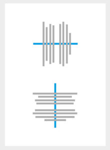
1. Hierarchy
- is when an element appears more important in comparison to other elements in a design
 |
| Fig 5.1 An example of hierarchy |
 |
| Fig 5.2 Photographic example of hierarchy |
2. Alignment
- is the placement of visual elements so they line up in composition.
There are two types of alignment principles: edge alignment and center alignment.
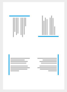 |
| Fig 5.2 Edge alignment is either to the right, left, bottom or top. |
 |
| Fig 5.3 Center alignment is aligned to a center line down the middle or across the horizontal |
3. Direction
a) Horizontal direction - signifies stability, calmness and tranquillity.
 |
| Fig 5.4 Horizontal Direction |
b) Vertical direction signifies balance, formality and alertness.
c) Diagonal direction signifies movement and action.
 |
| Fig 5.5 Diagonal Direction |
Exercise
For this exercise, we had to take our own photos and put them into Photoshop. It couldn't be photos that we took during vacations; it had to be taken from today onward up until we had the critic session. So I had a perfect idea!! I have 4 cats and a dog so I wanted to take their faces from an up-chin perspective. Here are the main photos I used (my inspiration photos because I like to take photos of my cats from this angle since it's funny):
 |
| Fig 5. My cat Miko (Emiko for full name) |
 |
| Fig 5. My cat Wendy |
 |
| Fig 5. My cat Ollie |
 |
| Fig 5. My cat Tony |
I did not choose my dog Gracie because she has a rectangle face so I couldn't get it from an up-chin perspective. The idea behind this was so that you could see my cats look down at you from the photo I used. At first, I wanted to only put the 4 photos of my cats at the side but then I thought it would look better with more faces in the middle but after the feedback, Ms Sherry said it looked like a pattern, so I removed the middle photos and left the 4 photos at the side so it gave a perspective.
 |
| Fig 5. My initial collage that looked like a pattern |
 |
| Fig 5.My final collage after feedback |
Feedback
Ms Sherry and Ms Anis were confused about my photo at first because it did not represent perspective like I wanted it to. They said it looked like patterns because of all the pictures of cats together but after I explained that I wanted it to look like the cats were looking at you from all the sides of the photo, Ms Sherry understood what perspective I was trying to show but it would be better if I removed the cats and the dog in the middle and just leave the cats at the sides. After I edited my final photo I asked Ms Anis to take a look and she told me to make the cats on the sides a little bit bigger. And finally, I asked Ms Sherry to take a look at it again and she said that it fits the topic perspective thus she also told me to put the before and after pictures in the e-portfolio.
Lecture: Pushed forward to the following week
1.5.19 (Week 5)
We only had critic session for Thursday's class because we came back from Fabspace in Kuala Lumpur so we were exhausted from the trip.
Lecture 4: Texture, Repetition, Surface and Pattern
24.4.19 (Week 4)
Today's lecture was about texture, repetition, surface and pattern that was presented by our classmates.
1. Texture
- the surface quality of a three-dimensional volume or two-dimensional shape
- can enhance visual surface and conceptual meaning to a design
 |
| Fig 4.1 Texture |
2. Surface
- top layer of an object
- use to identify an object
- what we see in 2D
 |
| Fig 4.2 Surface |
3. Repetition
- is when the same visual element is being repeated continuously throughout the design
 |
| Fig 4.3 Repetition |
4. Pattern
- is an underlying structure that organises surfaces or structures in a consistent, regular manner.
- a repeating unit of form or shape
- known as the "skeleton" that organises the parts of the composition
 |
| Fig 4.4 Pattern |
Exercise
This week's exercise was about a pattern. I had a hard time figuring what I wanted to do or what I wanted to use. I ended up picking 4 different types of vegetables using 5 different colours; which I actually got the idea from using these colour palettes:
 |
| Fig 4.5 Beach colour palette #1 |
 |
| Fig 4.6 Beach colour palette #2 |
Here is my final piece; for the green paint I used lotus; blue: bitter gourd; yellow: cauliflower; orange and brown: lady's fingers. I was pleased with how the final outcome turned out.
 |
| Fig 4.7 Final Pattern |
Feedback
Ms Sherry said that the materials I chose go well together because they have similar shapes even though they were by different vegetables; she also liked the negative space between the patterns. She asked me what the green shape was used for because she was fascinated by it having pretty patterns and I told her it is normally used in soup.
Lecture 3: Balance, Symmetry, Asymmetry and Emphasis
17.4.19 (Week 3)
Ms Sherry started the class by telling us about the lecture on Saturday that we had to attend called 'Future Imaginings'. We then had a lecture about balance, symmetry, asymmetry and emphasis presented by some of my friends. The lecture included important words to remember for this topic like shapes, value, texture, eye direction and colour.
Symmetry: is when a design can be cut horizontally or vertically but still remain the same shape
Asymmetry: is when a design has the same number of curves or straight lines but still looks the same
Balance: is when the colours, textures, visual weight of objects and space are evenly shared in a composition
Emphasis: is when a certain object or area in an artwork catches your eye and becomes the main attraction
 |
| Fig 3.1 Symmetry |
 |
| Fig 3.2 Asymmetry |
 |
| Fig 3.3 Emphasis |
 |
| Fig 3.4 Balance |
Exercise
For this exercise, we had to make an artwork base on balance, symmetry, asymmetry and emphasis using only watercolour and pastels. Initially, I wanted to draw a girl with the day of the death make up (in Spanish its called Día de Muertos) but the outlines were too small for me to use with pastels. So then I went on Pinterest and I got inspired by these pictures:
Which then brought me to this draft; where I combined most of the elements together
 |
| Fig 4.1 Final draft |
 |
| Fig 4.2 Final Piece |
Feedback
Ms Sherry told me that it is actually symmetrical and not asymmetrical because there can also be diagonal symmetry. She also added that because of the darker pigment on the lotuses it gives the picture more of an in-depth feeling. And a classmate also said that the yellow colours remind him of a hypnotist.
INSTRUCTIONS
Lecture 2: Gestalt
10.4.19 (Week 2)
We started the class with Ms Sherry apologising about the timetable changes. She then told us that it was going to be her last day to lecture us and that we were going to do presentations for the next 6 weeks instead. The class started with a clearer overview of what the class would look like for the whole semester; Ms Sherry went through her instructions with what she wanted for our e-blog.
In the e-portfolio she wanted:
- to find design principles easily (as in the section of the blog)
- use the nickname we would like to be called
- the blog to be IN REVERSE chronological order
- 2 examples from research
- a comment section
- a good final piece (without bad lighting)
After that, she proceeded with a lecture called Gestalt. Ms Sherry showed us pictures of company logo's and asked if we could see anything with the pictures, here are two examples:
 |
Fig 2.1 A Le Tour de France logo
|
 |
Fig 2.2 A FedEx logo
|
From the two pictures, I noticed that gestalt could mean one picture but it has two different parts or meanings. It feels like a hidden meaning playing tricks on our eyes or brain. At the end of the lecture, she introduced the second exercise to us based on gestalt. The materials that we could use were pen, pencil and markers but it could only be black in colour and on an A4 paper.
Exercise
I struggled with this exercise because I could not think of a way to put two images together using negative and positive images, then I researched online and I found a gestalt called reification. It is when you make something that isn't there appear with combining other shapes. The two examples I found:
 |
| Fig 2.3 |
 |
| Fig 2.4 The laws of gestalt |
Here is the drawing I came up with that didn't really fit into gestalt:
 |
| Fig 2.5 KLCC Twin Towers but there is a cake |
A few ideas I had that fit within the laws of gestalt
 |
| Fig 2.6 A few ideas I had that fit within the laws of gestalt |
The final piece that I went with
 |
Fig 2.7 A 'sun' flower
|
FEEDBACK
Ms Sherry said my drawing of the 'sun' flower made a circle without having to draw the lines connecting the circle, it was formed from the triangles. She also commented on how my gestalt was a different kind (reification) from my other classmates who played with the negative and positive space.
Lecture 1: Briefing and Contrast
3.4.19 (Week 1)
For the first week, we were introduced by Ms Sherry and Ms Anis as our lecturers for this semester. Ms Sherry proceeded to give us an overview and what to expect from this course. After that, she gave us an ice-breaking exercise to do; we had to pair up with someone and get to know them thus drawing their faces. We then had to hang up the drawings on a line and had a critic session. Ms Sherry also notified us of how we were going to have a critic session each week for our exercises/assignments. After a 5 minute break, the class went on with the lecture about contrast. Ms Sherry showed us some pictures on contrast and asked if we could see any contrast within the pictures. From the examples, I took note of what could be called contrast; shapes, fonts, sizes, colours, texture and even angles. She then gave us our first exercise to do which were based on colour contrast. We could only use black and white paper and no other writing materials.
Exercise
For this exercise I had various ideas; like a sloth or a breaded dragon but I wanted to do something creepy since the black and white contrast will really bring it out. My inspirations for my artwork:
 |
| 1.3 My first draft |
 |
| 1.4 My second draft |
 |
1.5 My final piece I chose of Pennywise (the clown)
|
The two attempts I made but I chose fig 1.7
 |
| Fig 1.6 Supposed to be my final piece but the middle piece did not look like a boat |
 |
| Fig 1.7 My final piece that I was happy with |
At the end of the whole exercise, I felt relieved and satisfied. There is also a story behind my piece that I did and its mostly based on the movie IT. The boat in the middle symbolises an origami boat, which is a big spoiler about the movie. And when I thought of a tunnel I immediately picture Pennywise (the clown in IT) in the drain. The one star is the leader of the group and the other six are the kids that follow him.
Feedback
Ms Sherry told me that my artwork was powerful because it had a symmetrical placement of where the clown head was. It also showed that the work was playful due to the stars in the sky thus she also added that she would not want to go into the tunnel. She concluded my piece by saying that it has a balanced to it because of how the starts and the tunnel go well together.


Comments
Post a Comment