Typography - Exercises

Abigail Bea Chong Ka Yee (0333966)
Typography
Exercises
LECTURE NOTES
Lecture 1: Briefing
5.4.19 (Week 1)
For the first week of class, Mr. Vinod did not conduct a lecture, rather he gave us an insight view of what to expect during our course; about future assignments, exercises that will be given and that we had to create an e-blog. Mr. Vinod suggested Wordpress as a blog site we could use. After we created our blog, Mr. Shamsul showed us step by step to set up our E-portfolios. Mr. Vinod then proceeded to give us instructions for our first lettering exercise. Before dismissing the class he mentioned to download three specific Adobe software (Photoshop, Illustrator and InDesign) and to bring our laptops next Friday.
After a short break, he then told us about our first exercise of the week which was lettering. Mr. Vinod's informed us that we should sketch about 10 different fonts that will match with our personality the best on a graph paper.
Lecture 2: Introduction to Typography
12.4.19 (Week 2)
The class started with Mr. Vinod asking us what typography is. According to oxforddictionaries.com typography is "the style and appearance of printed matter". He then proceeded to say that the only way to actually understand typography is if we study and have the knowledge about it. Other than that, school textbooks are actually the worst kind of designed books Mr. Vinod has ever seen. Thus with such a big number of people in our class, there's bound to be different kind of learns e.g; kinetics, auditory and visual learners. He also said that when you look at a design you need to analyse, dissect it, evaluate and synthesised it. Be able to translate and benchmark on what you have read.Three important terminologies in typography:
- Font: where typefaces are presented or displayed
- Typeface: a group of characters like numbers, letters and punctuation that share a common design and style
- Type Family: a typeface where an entire family of fonts shares similar characteristics
Lecture 3: Basic / Describing Letterforms
19.4.19 (Week 3)
Mr. Vinod started the class with a lecture on letterforms, he also mentioned that the word 'Lexicon' can help us in our future researches. Thus knowing the component parts of a letterform makes it easier to identify typefaces. Here are some of the components that were mentioned in class today:
Lecture 4: Development / Timeline
26.4.19 (Week 4)
Today's lecture was about how typography all started. Early letterform development started with the Phoenician; they wrote in uppercase forms which were a combination of straight lines and pieces of circles. Then came the Greeks who read text alternately from left to right then right to left based on the style of writing they developed called 'boustrophedon'.
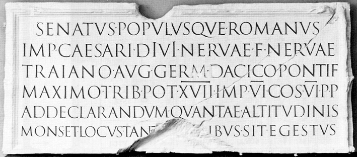
After the Greeks came the Romans; square capitals were the written versions of letterforms which can be found on Roman monuments. But as time passed they evolved into rustic capitals; a compressed version of square capitals thus also taking less time to write.
Throughout the time of Charlemagne's empire; text was constantly written and rewritten all around Europe. Hence, introducing the standard calligraphy for a century. Not long after, Blackletter a condensed, strongly vertical letterform rapidly gained popularity. Gutenberg introduced printing which mimicked the work of scribe's hands. His type of mold required different brass matrices or negative impressions, of each letterform.
INSTRUCTIONS
EXERCISE
Lettering (Week 1 - Week 3)
For this exercise we were asked by Mr. Vinod to create 10 different fonts using one personality that describes ourselves, it was quite difficult at first but I managed to push through. I chose the word 'creative' as my personality and here are my sketches:
Week 2
For this week, we had to show our sketches that we drew for our personality to be approved by the lecturers. Fig 1.4 was the only font that I was able to use for my personality 'creative', that I made the letter 'g' and 'a' more visible. After that, I begin to draw out the letters digitally using adobe illustrator.
Week 3
For this week with had to start creating animations with our fonts but I had a lot of trouble with designing and creating my letter 'B' 'I' 'G' 'A' because of my inexperience with using adobe illustrator, so Mr. Vinod asked me to sit next to him so he could show me the correct way to make the shapes and not draw it by free hand. Moreover, in the end I managed to only complete my lettering in class and had to go back and start my animation.
It turned out better than I expected it to be. Furthermore, I thought it would be nice to make my letters move with a walking motion but then it would not be creative enough I animated my letters doing what they were made to do.
Mr. Vinod started the class with a lecture on letterforms, he also mentioned that the word 'Lexicon' can help us in our future researches. Thus knowing the component parts of a letterform makes it easier to identify typefaces. Here are some of the components that were mentioned in class today:
- Baseline: An imaginary line upon which the base of each capital letter rests
- Median: An imaginary line that defines the x-height of letterforms
- X-height: The distance from the baseline to the median. The height in any typeface of the lowercase 'x'
- Stroke: Any line that defines the basic letterform
- Apex / Vertex: The point created by joining two diagonal stems e.g the peak triangle of an uppercase A
- Arm: The projecting horizontal stroke that is unattached on one or both ends, like the letter T and E
- Ascender: The stroke on a lowercase letter that rises above the median
- Barb: The half-serif finish on some curved stroke
- Beak: The half-serif finish on some horizontal arms
- Bowl: The curved stroke enclosing the counterform of a letter
- Bracket: The transition between the serif and the stem
- Cross Bar: The horizontal stroke in a letterform that joins two stems together
- Cross Stroke: The horizontal stroke in a letterform that joins two stems together
- Crotch: The interior space where two strokes meet
- Descender: The stroke on a lowercase letterform that falls below the baseline
Lecture 4: Development / Timeline
26.4.19 (Week 4)
Today's lecture was about how typography all started. Early letterform development started with the Phoenician; they wrote in uppercase forms which were a combination of straight lines and pieces of circles. Then came the Greeks who read text alternately from left to right then right to left based on the style of writing they developed called 'boustrophedon'.
 |
| Fig 1.1 Boustrophedon |
 |
| Fig 1.2 Square capitals |
 |
| Fig 1.3 Rustic capitals |
 |
| Fig 1.4 The Gutenberg Bible |
INSTRUCTIONS
EXERCISE
Lettering (Week 1 - Week 3)
For this exercise we were asked by Mr. Vinod to create 10 different fonts using one personality that describes ourselves, it was quite difficult at first but I managed to push through. I chose the word 'creative' as my personality and here are my sketches:
 |
| Fig 1.1 My first draft for creative |
 |
| Fig 1.2 My second draft for creative |
 |
| Fig 1.3 My third draft but a little bit bigger for creative |
 |
| Fig 1.4 My final draft that symbolises creativeness |
For this week, we had to show our sketches that we drew for our personality to be approved by the lecturers. Fig 1.4 was the only font that I was able to use for my personality 'creative', that I made the letter 'g' and 'a' more visible. After that, I begin to draw out the letters digitally using adobe illustrator.
 |
| Fig 2.1 My traced version for creative |
 |
| Fig 2.2 My coloured Version for creative |
 |
| Fig 2.4 Coloured Version for creative (before feedback) |
Week 3
For this week with had to start creating animations with our fonts but I had a lot of trouble with designing and creating my letter 'B' 'I' 'G' 'A' because of my inexperience with using adobe illustrator, so Mr. Vinod asked me to sit next to him so he could show me the correct way to make the shapes and not draw it by free hand. Moreover, in the end I managed to only complete my lettering in class and had to go back and start my animation.
 |
| Fig 3.1 After feedback and some touching up for my personality 'creative' |
It turned out better than I expected it to be. Furthermore, I thought it would be nice to make my letters move with a walking motion but then it would not be creative enough I animated my letters doing what they were made to do.
At first, I did not know how to start animating the letters but once I got the hang of it, it came out the way I wanted it to be. I have a total of 42 artboards.
 |
| Fig 3.2 Screenshot of my illustrator artboards for creative |
Here is the gif that shows my personality creative.
 |
| Fig 3.3 Final Outcome of my animated gif that shows creativity |
For this exercise, using only the specific typefaces that Mr. Vinod gave us, we had to express the six words given to us which were; hungry, faint, loop, freeze, levitate, bounce and angry (initially we had to choose 6 out of the 7 words we chose). The words I chose to express are shown below
 |
| Fig 4.1 First attempt at type expressions |
Mr Vinod said that I should make the letter 'O' bounce, the levitate letters should be further away and that the angry should express angry more.
 |
| Fig 4.2 Finalised Version after feedback |
We had to animate one of the expressions and I chose 'FAINT' as my expression.
 |
| Fig 4.3 Artboards for the expression faint |
 |
| Fig 4.4 Artboards for Faint |
 |
| Fig 4.5 Animation for Faint |
FEEDBACK
Week 1: Mr. Vinod did not give us feedback for the first class since it was only the introduction of the module.
Week 2
Specific Feedback: I showed Mr. Vinod and Mr. Shamsul the 10 fonts that I drew for our lettering exercise, thus telling them what personality that I chose which was creative. Mr. Vinod chose the font that looked closest to the word and the font was actually just a bunch of stationery together. He advised me that I should rationalise the letter 'G' and make it a little bit more detail. He also thought that the fonts were interesting.
Week 3
General Feedback:
Mr. Vinod told the class that it is okay to go back and complete our animation since our senior did not finish the work in a day. He also told us that we did not have to use the feedback he gives and do it in our own way but only if we don't want to learn.
Specific Feedback:
Mr. Vinod told me that I should make the letter ‘G’ more rounded and the letter 'A' more realistic so that it looks like a pencil. He also taught me the correct way to make the letters I wanted using shapes and filling them with black instead of colouring them with a brush.
Week 4
General Feedback:
Mr. Vinod mentioned three important feedbacks to us which were; do not delete other people's comment in the google sheet; do not change the original font type which is Arial 10; don't delete the red text which are the feedbacks from our lectures. He also told us that we do not need to complete animating our type expression in a day, because to make it look good and flow nicely in a gif it takes time.
REFLECTION
Experiences
Week 1: I actually read a little bit of typography before I attended the first class and to my surprise, it was pretty accurate as to what I imagined but just a little bit more detailed. It was also my first time borrowing a book from the library.
Week 2: Had our first lecture on typography and I did not know about the differences between typeface, font and type family. The history behind where typography came from was appealing.
Week 3: This was a frustrating Friday for me because my friends were already animating their letters while I was still working on my fonts. On the other hand, Mr. Vinod showed me the proper way to make my letters properly without drawing it free hand and colouring in with a brush using adobe illustration.
Week 4: I'm still getting used to using Adobe Illustrator thus I have a hard time remembering the shortcut keys. I struggled a bit with the type expression exercise but I completed the 6 words on time.
Observations
Week 1: The 6 hours past by gradually and the room was exceptionally cold on that day. I had a feeling that the typography class was going to be tough.
Week 2: I noticed that there were some new faces that I have not seen in week 1 and that a lot of people were lining up to show their fonts to the lecturers. 5/4/19 - 12/4/19 (Week 1 - Week 2)
Week 3: The lecture ended faster than I imagined and I did not expect Mr. Vinod to help me with my letter ‘B’ which was a tape dispenser with tape and my letter ‘I’ which was a pin.
Week 4: The class felt longer than the previous week and it was unusual sitting on the chairs behind the classroom. Besides that, I had a rough time trying to delete the outline of a specific shape but I learned it the hard way by using the shift key + m and alt to delete the part I did not need.
Findings
Week 1: I found myself being fascinated with the art of words, I did not know that it plays such a big role in designing.
Week 2: I found out that using Adobe Illustrator is hard to get used to but once you know your way around the tools, it is manageable.
This book is about how type is found everywhere, even if you're not in the design field; you would see fonts literally all around the world. The top two ways on how type is portrayed that got my interest the most in this book are Gourmet And Gourmand Lettering and The Faded Past. I have seen a lot with food being in letters but back then I did not think of it as typography. Gourmet And Gourmand Lettering - it is a "green type" letter that can be made from nature's bounty or flora and fauna. For example, solid foods are easy to manipulate into the alphabets:
Week 4: The class felt longer than the previous week and it was unusual sitting on the chairs behind the classroom. Besides that, I had a rough time trying to delete the outline of a specific shape but I learned it the hard way by using the shift key + m and alt to delete the part I did not need.
Findings
Week 1: I found myself being fascinated with the art of words, I did not know that it plays such a big role in designing.
Week 2: I found out that using Adobe Illustrator is hard to get used to but once you know your way around the tools, it is manageable.
Week 3: For this week it was a lot for me, I found out that I needed to increase my skills in Adobe Illustrator to be better in my exercises. Thus learn how to utilize the proper tools so that in the future using Adobe Illustrator wouldn't be so hard.
Week 4: I found that I needed to plan my time wisely for the animation and that I had to try different words before finding the perfect one to animate.
FURTHER READING
TYPE MATTERS by Jim Williams
5.4.19 - 12.4.19 (Week 1 - Week 2)
What I've noticed about this book is that it is very easy to understand how it explains typography. According to the author, typography is the voice of the written word. Back then in the mid-15th-century Blackletter was used as Germanic manuscripts. Fast forward to the 19-20th century where Sans Serif typeface was displayed as design characteristics. He also explained about the anatomy of letterforms which I noticed is to the very basics of a font. Here is an example of what I am referring to:
TYPOGRAPHIC UNIVERSE by Steven Heller and Gail Anderson
19.4.19 - 26.4.19 (Week 3 - Week 4)
Week 4: I found that I needed to plan my time wisely for the animation and that I had to try different words before finding the perfect one to animate.
FURTHER READING
TYPE MATTERS by Jim Williams
5.4.19 - 12.4.19 (Week 1 - Week 2)
 |
| Fig 5.1 TYPE MATTERS! |
This book explains the background of typography and where it came from.
What I've noticed about this book is that it is very easy to understand how it explains typography. According to the author, typography is the voice of the written word. Back then in the mid-15th-century Blackletter was used as Germanic manuscripts. Fast forward to the 19-20th century where Sans Serif typeface was displayed as design characteristics. He also explained about the anatomy of letterforms which I noticed is to the very basics of a font. Here is an example of what I am referring to:
 |
| Fig 5.2 Anatomy of Letter Forms |
19.4.19 - 26.4.19 (Week 3 - Week 4)
 |
| Fig 5.3 TYPOGRAPHIC UNIVERSE |
 |
| Fig 5.4 LOVE CHIPS by Sonia Lamera |
 |
| Fig 5.5 A book on 'an end to all things' by Jared Yates Sexton |
The Faded Past caught my interest the most because it is about the types that are known as "Ghost" that are faded letters that are no longer in use. Across abandoned buildings, businesses or even products; the types were always there but just as a pass-by. Even though these types have lost their function there is still beauty in them.
 |
| Fig 5.6 Oil Lamp Graffiti by Maya Drozzdz/VisualLingual |
 |
| Fig 5.7 Ancient Order Of Foresters by Tom Bland |


Comments
Post a Comment